Solution
Due to the existing brand awareness and positive brand association, it was important for us to remain sensitively faithful to the existing identity in our design work. We felt that the positive connotations of the shield in the original logo, with its suggestions of protection, worked well, so our designers embarked upon a quest to create the perfect shield.
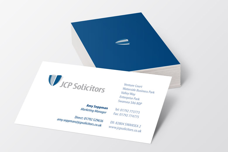
The new logomark is the product of a long (and intense!) development process. Not only is the end result instantly recognisable as a shield, but it also resonates with significance. The design gives the impression of being formed from pages of a contract whilst also incorporating degrees of transparency – a strong attribute for a modern law firm.
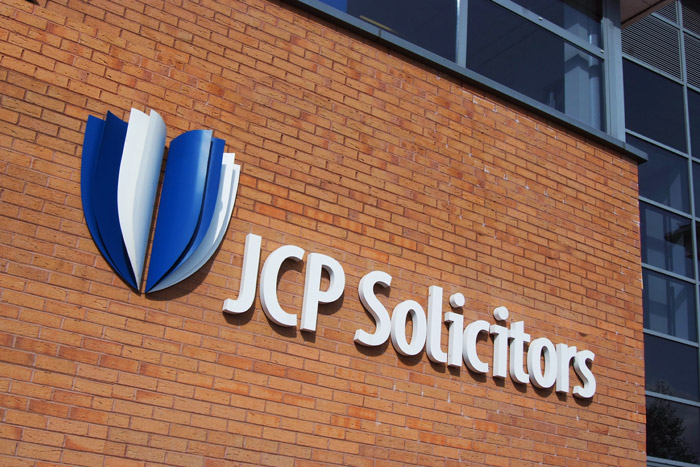

The concept behind the shield design involved a consideration of the various ways in which viewers would perceive the image. Components of the design are arranged in such a way that the shape can be viewed as a single symmetrical shield, or two shields facing each other in preparation for a duel. The perspective of the design is such that the viewer feels as though they are standing behind the shield, benefitting from its protection.
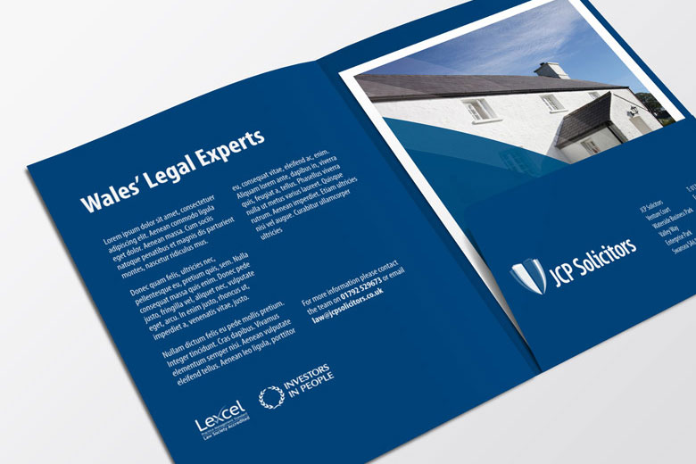
The introduction of a complementary colour palette to differentiate between JCP Solicitors’ many divisions has made communications clearer within the firm, and makes the creation of more targeted marketing messages from each department easier. We haven’t reinvented the wheel with the selection of a new overall colour for the brand. Sticking with blue makes sense as it encourages recognition amongst JCP Solicitors’ audience, but we’ve gone with a more modern, yet classic, smoky blue.
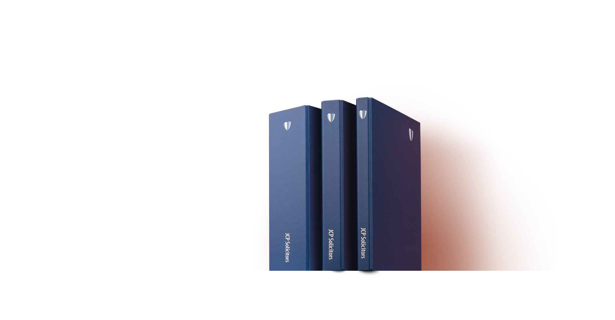
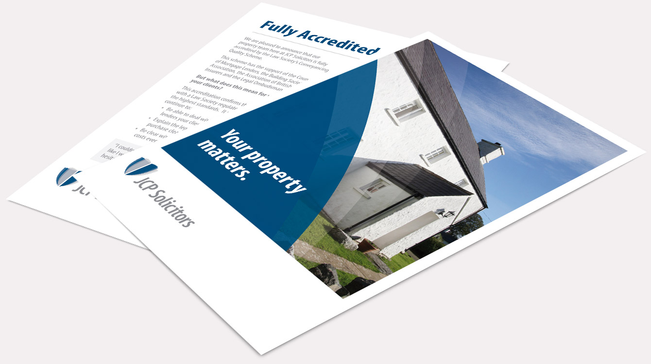
The logomark allows JCP Solicitors to be flexible in the application of their branding. It works when used alongside or independently of the ‘JCP Solicitors’ logotype, an important consideration as JCP Solicitors’ communications vary so much in format.
James Good Limited stepped in to create a modernised identity that would not only more accurately reflect the new business structure, but eliminate confusion and encourage consistency amongst staff, clients and associates when referring to the firm.
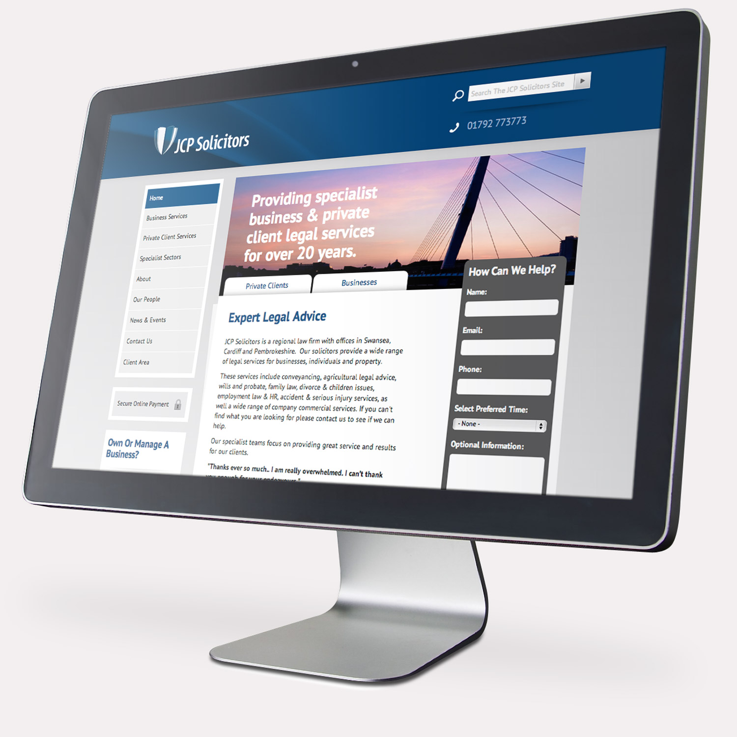
With planning and careful consideration to the user’s journey, JCP Solicitors are able to clearly communicate the full depth and diversity of their service offering with a content‑rich website, whilst maintaining a positive user experience.