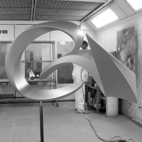
In a recent rebrand, Eurostar has demonstrated perfectly that brand identity extends beyond the logo. Interestingly, the whole concept is based on a brand sculpture (pictured left), from which every other form of Eurostar communication stems, from the branding on the train itself, down to the signs on the toilet doors.
Not everyone’s a fan of this project by design agency SomeOne, but we like it. It’s a truly imaginative piece of work, a result of thinking differently; after all, that's what good design is all about!
Source: Creative Review


